One of the first things you learn about Linux is that what you see on your screen doesn't always match what you see on someone else's. The interface, the way you interact with your PC, is often completely different even though you're both using the same operating system.
Windows and macOS both have one interface or desktop environment. Linux has many, and two of the most popular are KDE and GNOME. But how do you choose between them?
The User Interface
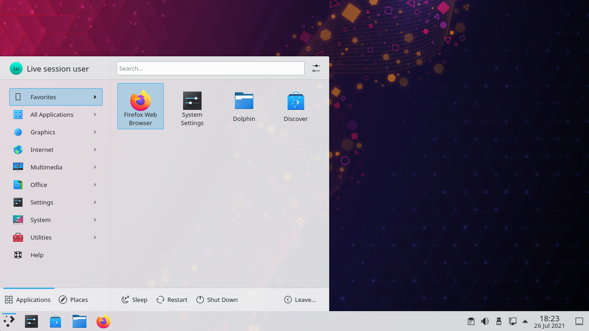
The KDE community refers to its desktop as Plasma. Plasma defaults to a Windows-style layout likely to be familiar to many people using Linux for the first time. The application launcher is accessible from the bottom left, apps appear in a panel along the bottom, and system indicators are in the bottom right.
KDE applications have minimize, maximize, and close buttons in the title bar. Under there, you will find a menu bar in many, though not all, programs designed specifically for KDE. Note that when it comes to KDE, everything mentioned here refers only to the way things appear by default. You can change all of this if you prefer.
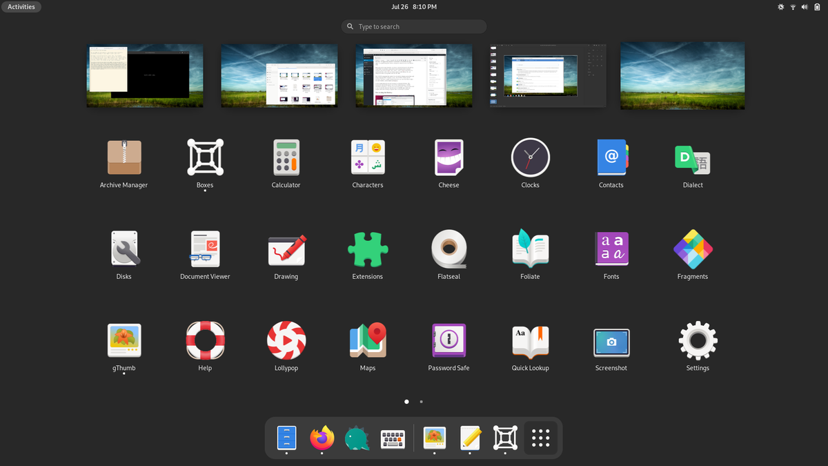
As for GNOME, the community has spent over a decade developing an interface and design language that's uniquely its own. The workflow centers around the Activities Overview, a single location where you can search for files or apps, see open windows, and navigate workspaces. You zoom into a workspace when you're ready to use an open app, and you zoom back out into the Activities Overview to get a good view of all that you're doing and to start doing something else.
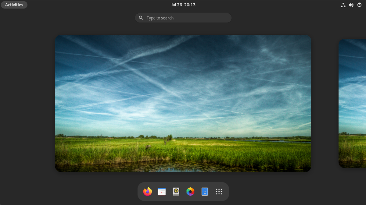
GNOME applications do not have minimize or maximize buttons. This minimalism extends throughout much of the design language. GNOME developers subscribe to the view that every extra option or button comes with a cost, to both the developer and the user. So GNOME apps tend to be simpler, dedicated to doing a singular task as intuitively as possible.
Customizing the Desktop
KDE Plasma is arguably the most customizable graphical user interface available for any desktop operating system, period. Without having to install any special software or tweak any lines of code, you can adjust almost every aspect of how your desktop looks.
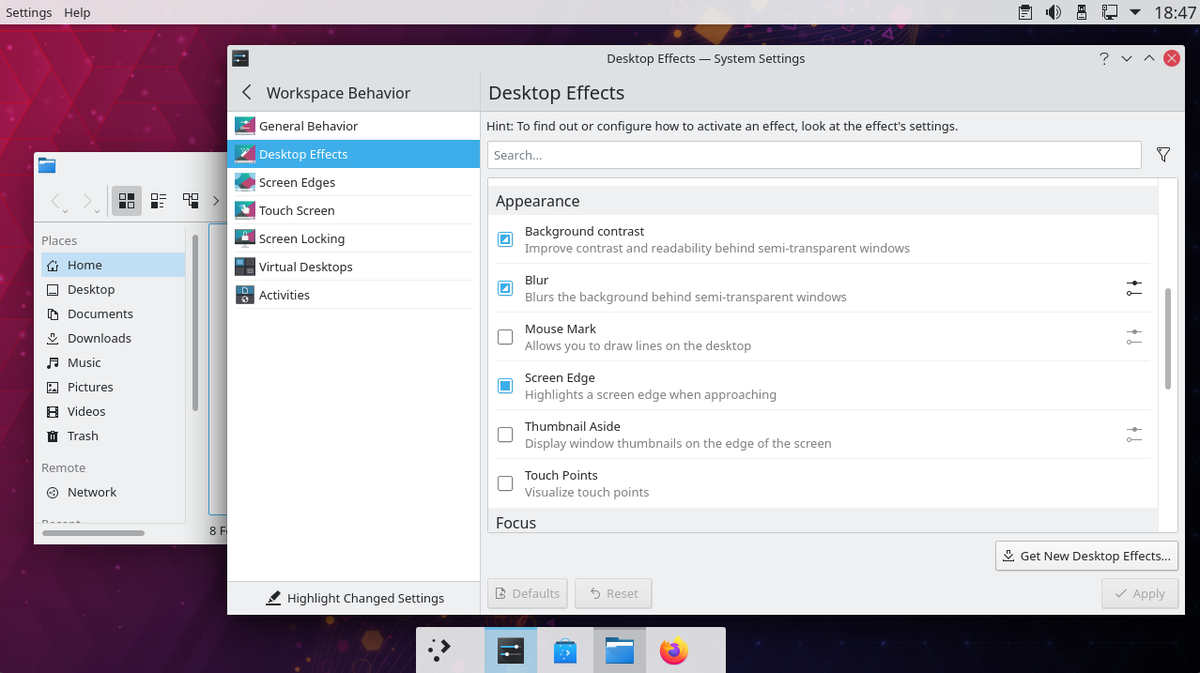
Example tweaks include changing the size and position of your panel, the widgets that appear on the panel or on your desktop, the theme, the buttons that appear in application title bars, fonts, app icons, and app names in the app launchers.
GNOME is not as customizable as KDE out of the box. Even basic customizations, such as changing system fonts, require installing the GNOME Tweak Tool, rather than looking in system settings.
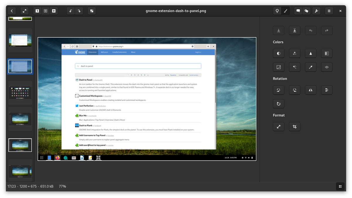
But GNOME does have an ecosystem of extensions, similar to what you find in web browsers. With these extensions, you can fundamentally change how your desktop works. If you want the dock to be always visible, there's an extension for that. If you really want to keep a Windows-style workflow, there's an extension for that too.
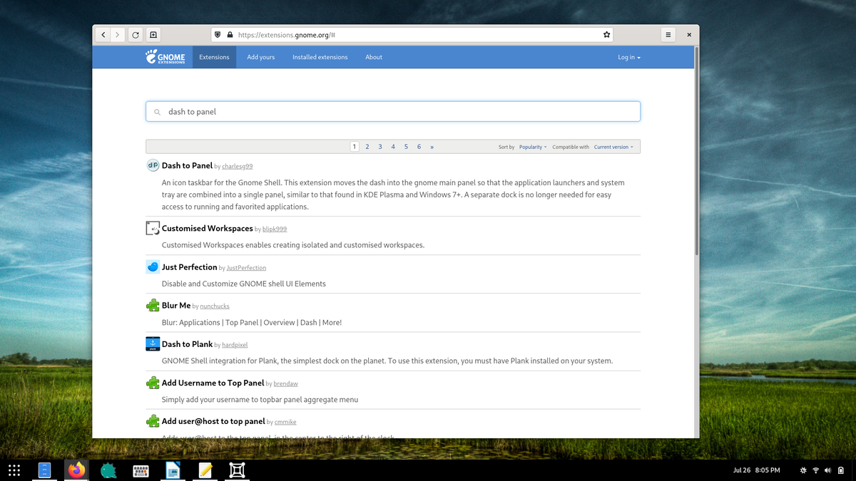
To make use of GNOME extensions, you have to know that they exist and where to find them. In contrast, KDE bakes add-ons directly into the desktop. You can install themes, wallpapers, desktop effects, and more just by hitting the Get New button that appears throughout the system settings.
Customization can be a double-edged sword. The GNOME desktop comes with a greater degree of polish, perhaps in part because it can't be so intricately customized. The little details matter when users are stuck with them. On KDE Plasma, if the spacing is off here or the font is poorly sized there, it's less of a big deal because the user can, and probably will, change it.
Applications
Almost everyone is a big fan of GNOME's design language, and most of the apps are designed specifically for GNOME. If you want to write an article, you can use the markdown editor Apostrophe. For those who want to manage photos, gThumb is there to help you out. To most users, GNOME software hones in on what's essential in a way that helps them focus on the task at hand.
Yet while many users prefer GNOME apps, there's little denying that KDE has a wider selection of software and more powerful options to choose from. GNOME does not have a photo manager quite as powerful as digiKam or a video editor as comprehensive as Kdenlive. KDE's Krita has become a go-to illustrative tool for people who have never used Linux.
KDE also has plenty of niche software, such as Marble for looking at our planet and KStars for looking at the stars. You can find a comprehensive list of KDE software over at apps.kde.org.
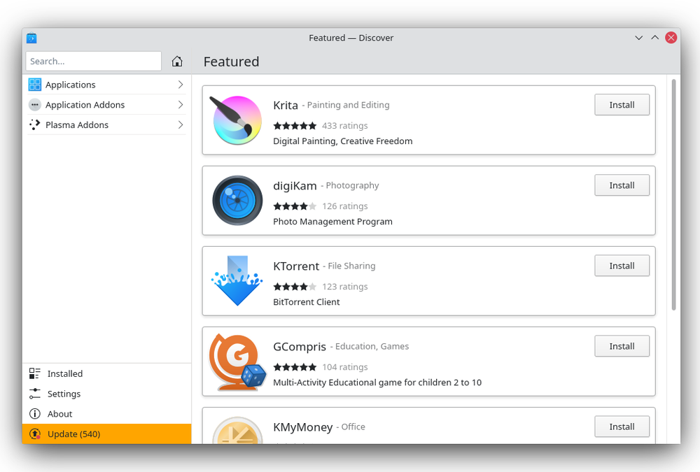
With KDE, you can begin customizing the applications to your liking—hiding menubars, adjusting visible panels, and tweaking this or that. The user interface elements are precisely the ones users love the most. There's no "one" approach to app design that works for everyone. GNOME takes an opinionated approach to app design. KDE leaves more of the decision-making to you.
Ease of Use
Which desktop environment you consider easier depends in part on your expectations and your existing technical proficiency. For people already familiar with Windows, KDE Plasma may provide an easier transition.
On the flip side, many people have always found Windows and traditional desktop interfaces to be complicated and confusing. This is part of the reason for such widespread smartphone adoption, whose interfaces are not as complex.
GNOME's design language is much closer to what many of us have experienced on our phones and tablets. That means GNOME is relatively easy to figure out regardless of whether you have used a computer before.
GNOME also places an emphasis on making sure the computer is accessible to as many people as possible, not only including an area of system settings devoted to accessibility but considering accessibility issues in the design language of the apps themselves. But thanks to the sheer customizability of Plasma, there are some ways you can tweak KDE to suit your needs that you simply can't easily do on GNOME.
GNOME allows you to do most tasks from a single location, the Activities Overview, which you can quickly activate by moving your mouse to the top left or hitting the Super key. Launching apps or switching to an open window is as simple as pressing the Super key, typing the first few letters of the app's name, and hitting Enter.
KDE can functionally do the same thing, but the features are spread out between the application launcher, the panel, various widgets, and KRunner (activated by pressing Alt + F2).
There is a downside to GNOME's approach. The Activities Overview zooms in and out of focus, and it's something you're likely to interact with often. This motion can be physically straining for some people, who may find the relatively static nature of the Plasma desktop easier to handle for this reason.
In general, GNOME presents fewer options, which reduces the complexity. KDE menus not only display a vast assortment of features but the way it displays the settings is less consistent. Some apps have a menu bar, some have a hamburger menu button, and some have neither.
Use of System Resources
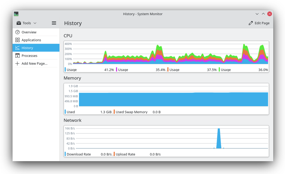
Both desktop environments feel fast on modern hardware. While KDE and GNOME both have their own pros and cons when it comes to the user interface, at the end of the day, one option uses fewer system resources than the other.
That's KDE Plasma. There's a reason both the Pinebook and the Pinephone, two relatively under-powered ARM devices, come with Plasma and Plasma Mobile pre-installed. This is also one reason why KDE makes a reasonable choice for Valve's Steam Deck. KDE Plasma has even managed to undercut some traditional lightweight desktop environments like Xfce.
KDE vs. GNOME: Which is Right for You?
While both these desktop environments provide numerous features to their users, an experienced Linux user would have definitely switched back and forth a few times between KDE and GNOME.
For those who are not interested in tinkering with their desktop, GNOME is a better choice. If you are someone who likes to customize and control the appearance of your OS, KDE Plasma is a no-brainer for you.
You can really create some efficient workflows by tailoring Plasma to fit your precise use cases and preferences. You may also make better use of your system resources. Whichever one you choose, you have access to some of the best software the Linux world has to offer.
Comments
Post a Comment