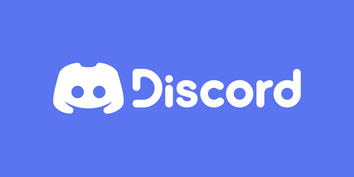
On May 13, 2021, online chat software Discord celebrated its sixth birthday with a complete brand overhaul. For the first time since its release in 2015, Discord's signature logo, font, and color were changed.
Soon after the announcement was made, it became very clear that a vocal number of users were not happy with the app's new look.
Discord's Branding: Before and After
The rebrand announcement was first posted to Discord's blog. While the changes don't look too drastic when comparing the old look and the new look side-by-side, all three components of Discord's branding have been changed.
Freeing Clyde From His Bubble
Not very many people know that the little smiley icon in Discord's logo actually has a name: Clyde. For some time, the white speech bubble that he's normally seen in was his home, but the Discord Design Team thought it was time to set him free. His shape has also been changed a little bit, as he used to be horizontally asymmetrical.
Additionally, Clyde has a handful of different expressions now, to allow him to "feel what he needs to feel".
New Typeface and Shade of "Blurple"
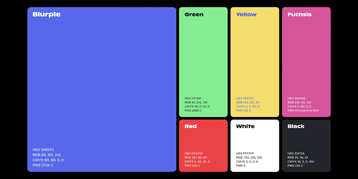
Discord's original wordmark was in sleek all capital letters, but the rebrand sees a more whimsical and curvy font choice in title case. It's a custom font (based upon another font known as Ginto) created by the Discord Design Team to go with the improved Clyde.
Meanwhile, the app's signature color "blurple" (a combination of blue and purple) has amped up its saturation for a more vibrant look.
Why Discord Users Don't Like the Rebrand
It doesn't matter where you look for opinions on Discord's new rebrand—you'll find much more negative feedback than positive feedback.
Here's a summary of the most popular reasons why Discord users are unhappy with the redesign.
1. The New Color Kind of Hurts to Look At
Not only are incredibly saturated colors rare to find in nature, but they're also pretty harsh on the eyes. For this reason, designers privy to how to use color theory for creative projects usually recommend brands lean more towards muted ranges of colors.
However, Discord has decided not to heed that advice, which has led to many disgruntled users.
"I would definitely call the new color more eye-straining, especially compared to the old, softer blue that wasn't nearly as intense," writes a user in response to Discord's rebranding announcement tweet. The user's response has nearly 5,000 likes, while other criticisms have also attracted thousands of likes on Twitter.
2. The New Font Looks Childish
With regard to Discord's new wordmark, it seems that users are split between two opinions. Some people think that the new font is okay, and that it just needs to be in all capital letters.
@discord Change the letters to all caps, works better pic.twitter.com/39XwY0S4lX
— Pelo (@_SrPelo_) May 13, 2021
But others say to scrap the new font entirely. It's meant to look friendly, but instead the dissatisfied users are calling it ugly and childish.
3. Why Change Something So Iconic?
Perhaps you've heard the saying "If it ain't broke, don't fix it". That's a quote that accurately sums up what some users seem to feel about the redesign. Aside from Clyde's asymmetry, there weren't any real problems with the branding Discord had.
Rebranding is a tricky thing—your brand's visuals are often what sticks in the minds of consumers the most. Having a signature look and feel makes your brand recognizable and familiar. The longer you take to rebrand, the more difficult it becomes.
Discord had been using its former logo, font, and shade of blurple since day one. It's been burned into the minds of its users over the course of six years, so now it'll take some time for the userbase to associate the look with the new brand instead of the old one.
4. The Community Has Made Better Redesigns
Whenever you complain about a product, supporters may tell you to go make something better yourself then. Which, is exactly what some users did.
One of the most popular fan-made redesigns is that of a user on Reddit, which has over 6,000 upvotes. The post is titled, "A better redesign than the new corporate shill logo, made in ~30 minutes by a 14-year-old".
The fact that some Discord users could make more appealing redesigns than the designated Discord Design Team only added even more fuel to the fire.
If you want to give your feedback on the redesign, the company encourages you to send ideas to the Discord feedback page.
Will Discord Restore the Old Brand Design?
Given the unexpected backlash that the company has received following the rebrand, it isn't too far-fetched to assume that the Discord team will either revert changes or try rebranding a second time.
The last time we saw the internet freak out over a brand's new look was when someone mistakenly thought that Mozilla removed the fox from the Firefox browser logo.
Comments
Post a Comment