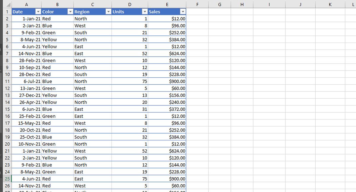
Pivot tables are one of the most powerful and useful features in Excel. With little effort, you can use a pivot table to build professional reports for large amounts of data.
You can group data into categories, break down data into years and months, filter data to include or exclude categories, and even build charts.
What is a Pivot Table?
Perhaps you are wondering what a pivot table is and how it can help you? You can think of a pivot table as a report. However, unlike a static report, a pivot table is an interactive view of your data.
Pivot tables allow you to look at the same data from different perspectives. In pivot tables, you can play around with your data in different ways.
The following steps will guide you through how to create a pivot table and how to use your pivot table to capture different views of your data.
Creating a Pivot Table
To understand pivot tables, you need to work with them yourself. You can see the full potential of pivot tables by using the biggest, most complex Excel datasheet you have.
The following method demonstrates how to create a pivot table so that you can find meaning in all of that seemingly endless jumble of data on your screen.
- Open the Excel spreadsheet you wish to analyze.
- Ensure your data does not have any empty rows or columns and that it only has a single row heading.
- Select the cells you want to create a PivotTable from by highlighting your data.
- Select Insert from the menu.
- Select PivotTable.
- In the pop-up window, ensure that the Table/Range is correct.
- Next select where you want the PivotTable report to be placed.
- Select New worksheet to place the PivotTable in a new worksheet or Existing worksheet.
- If you select the Existing worksheet, select the location you want the PivotTable to appear.
- Select OK.
Using Pivot Table Fields for Different Views
This is where it gets fun. You can now start manipulating your data to capture different perspectives.
Using the example data seen below, you can see some ways to filter your data for alternate perspectives. Follow the steps to use pivot table filters on your own data.

- Click on the PivotTable you built in the above steps.
- Under Choose Fields to add to report, check all of the boxes to capture a full PivotTable view of your data. Microsoft Excel will make some assumptions on how you would like your data analyzed, usually placing your values in the columns.
- The PivotTable will adjust to your new selections. By selecting the + beside the Row Label in your Pivot Table, you can expand your data for a full view.
- The PivotTable default data configuration for the example data shows a detailed breakdown of sales by month, date, color, and region. This is a valuable view if you are a sales professional.
- To sort your breakdown differently, you can drag and drop Rows. If you move the color to the top of rows, you can see the data change.
- To see individual breakdowns of a specific row, drag and drop it from Rows to Filters. In the example, you will see the sample data broken down by Region.
- A dropdown option will appear above your PivotTable, simply open the dropdown and select any specific filter option you wish to analyze.
- By selecting the + located to each Row Label item, you will see a detailed breakdown of your data.
Use of Pivot Table in Excel
If you're not sure what PivotTable Field settings would work best, give the Recommended PivotTables button a try, located right beside the Insert > PivotTable selection.
The Pivot Tables in Excel can take your analysis and presentation to the next level if you are working with large sets of data regularly. Hopefully, from the examples in this article, you now have the skills to begin deep diving into your data and see it from a fresh perspective.
Comments
Post a Comment